Thursday, 10 March 2022

Magazines assessment learner response'

 1) Type up your feedback in full (you don't need to write the mark and grade if you want to keep this confidential).

total:10 , grade:2

WWW: you start well but this tails off badly and overall this needs to be a lesson in the expected standards of written English, presentation and focus on the question.

EBI: Written English and presentation not up to GCSE  standards in this assessment. Needs to be a priorty to work on.


2) Read the mark scheme for this assessment carefully. Write down the mark you achieved for each question:

Q1: 2/2
Q2: 3/12 
Q3: 3/6
Q4: 2/8

3) Did you get any media terminology wrong in the assessment? Make a note of it here for future revision: 

No i just need to revise magazine CSPs


4) Look specifically at question 2 - pick out three points from the mark scheme that you didn't include in your analysis of the unseen Grazia magazine cover. 

colour scheme and what they represent, images , connotations.

5) Now look at question 4. Use the mark scheme to identify three points you could have made regarding how Tatler reflects British social and cultural values. 

i could've mentioned power and money, beauty standards and social class.

Gender stereotypes in advertising

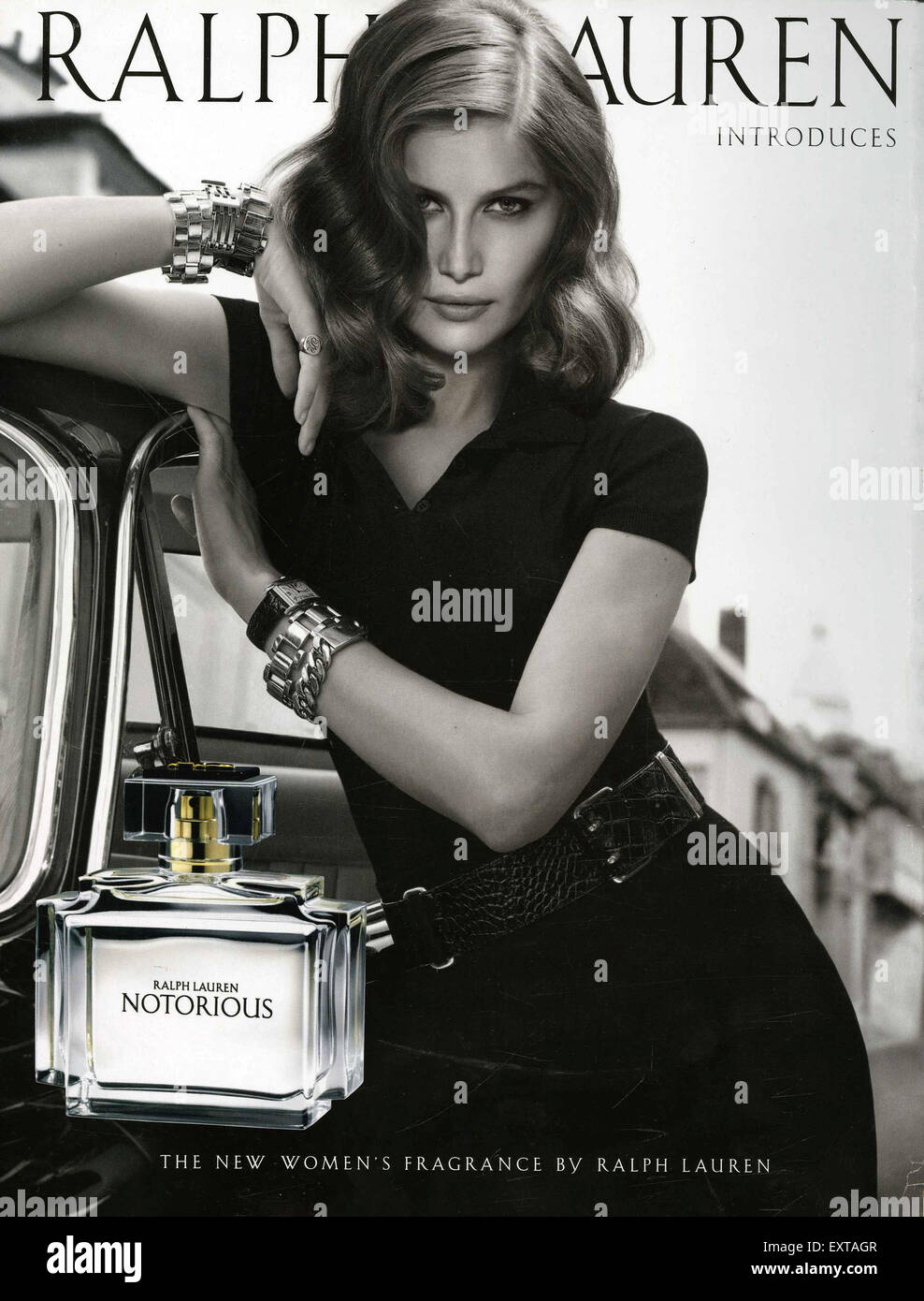
 1) Find three adverts featuring women that are from the 1950s or 1960s. Save the images to your Media folder as jpegs and then import them into your blog post. Hint: You may wish to look at car, perfume or cleaning products but can use any product you wish.


2) Find three adverts featuring women that are from post-2000. Save the images to your Media folder as jpegs and then import them into your blog post.


3) What stereotypes of women can you find in the 1950s and 1960s adverts? Give specific examples. 

That men rule their world and that women should only be built to please men and that they have to dress up and look beautiful all the time while smiling.

4) What stereotypes of women can you find in the post-2000s adverts? Give specific examples.

That they still have to look good and feel a certain way as they have a lot of pressure to be beautiful and perfect for standards.

5) How do your chosen adverts suggest representations of gender have changed over the last 60 years? 

Now women tend to be more independent and fearless and work for themselves not for a man.

Advertising case study 1: OMO print advert


1) What year was the advert produced?

1955

2) How were women represented in most adverts in the 1950s?

Women are represented like their only meant to be perfect housewives and mothers.

3) How does the heading message ('OMO makes whites bright') and the typography promote the product?

It promotes that it'll make even white even brighter and that its a modern , new and exiting quality of product.

4) Analyse the mise-en-scene in the advert (CLAMPS): how is costume, make-up and placement of the model used to suggest women's role in society?

Reinforces women should feel and look a certain way even if they are at home they should still wear makeup and do their hair and as in the advert the women is smiling it shows women should be grateful and happy.

5) Why is a picture of the product added to the bottom right of the advert?

So that adverts can recognise the product.

6) What are the connotations of the chosen colours in this advert - red, white and blue?

British flag, patriotism, links to the end of ww2.

7) How does the anchorage text use persuasive language to encourage the audience to buy the product? Give examples.

Because they add in repetition of 'bright' , 'white' which makes audience want to buy the product.

8) What representation of women can be found in this OMO advert? Make specific reference to the advert and discuss stereotypes.

Reinforces stereotype of women as housewives and mothers. Also tone of anchorage text is patronising to women as they are infantilizing women as they treat them as their children.

9) What is the preferred reading for this advert - what did the producers of the advert want the audience to think in 1955?

They wanted to think that women should be happy cleaning and working at home and also that by buying the product will make women happ
y.
.
10) What is the oppositional reading for this advert - how might a modern audience respond to this text and the representation of women here?

Modern audience would think this is just treating women as if they aren't as superior to men and should only be working at home to please their kids and husband and that it isn't fair or right and also how sexist and offensive this is to women.

Thursday, 10 February 2022

Magazines: Heat CSP case study

Introduction:

1. Write three things that Heat offers its readers under 'print'.

Central Image,Bar code and price,Name checks,colour scheme,cover lines.

2. What does the page say that Heat offers readers?

 The 'Posh CALL OUT' interest the audience in bringing their attention to wanting to know the drama between the upper class people.

3. What other content does Heat magazine offer its readers aside from celebrity news?

    Heat readers are overally obsessed with what their wearing and they depend on heat to provide them with the beautiful and affordable  online’s hottest latest trends.

4.What is Heat magazine's audience profile? Write all the key details of their audience here.

Female/male: 90%/10% ,

 Avg age: 37 ,

MARITAL STATUS: 57% MARRIED
or living with partner / 43%

Media langauge

1) How many of the 12 magazine cover key conventions feature on this edition of Heat? List them with specific reference to the convention on the CSP edition of Heat.


2) How are the cover lines written to make the audience want to buy the magazine? 
The cover lines are bold and big with bright colours, it stands out to catch the readers eye. 

3) What are the connotations of the Heat colour scheme on this particular front cover?
The connotations are the colours are bright, mostly feminine colours which  shows that theirs hot gossip because of the bright pink and how mostly females are interested in the latest gossip.

4) How are images used to create interest in the magazine? Find three reasons for your answer. (E.g. paparazzi images or aspects of mise-en-scene such props, costume, make-up, body position, facial expression etc.)

 There are celebreties on the  front cover which makes the audience want to find out more , the way the images are placed with the title shows theres more then one gossip which will intrigue the audience. .   

5) What differences can you find between the use of design and typography between Tatler and Heat? List at least three differences and explain the effect on audiences.

Tatler is more of a classy, rich, upperclass, where as heat is more cheap and more middle class as you can tell by their difference of outfits.


Representations

1) What type of celebrities appear on the front cover of Heat? List them here. 
 Prince Harry, Megan Markle, Liam,Cheryl, Giovanni.  

2) How are celebrities represented in Heat? (Positively? Negatively? Reinforcing or challenging stereotypes?)
 They are presented negatively as  it shows them where they are being presented at their worst times , not dressing up formally and classy. This shows there personal life and how their life ordinary people that go through normal stuff.

3) How are women represented on the cover of Heat? Think about both images and cover lines here.

Women are seen as gossiplovers  and getting caught on stuff that include there personal life  which is shown  as women  having 2 different lives one for social media and one for there personal drama that they try to hide . 

4) How is race and ethnicity represented on this cover of Heat?

They are all white or  british ,american,  Megan Markle is the only mixed race women that  is part of the front cover only because shes prince harry s wife which also the royal family that are WHITE dont want the kid to turn out coloured.

5) How do Heat and Tatler represent social class? What different social classes can you find in the features and celebrities on the cover? (E.g. middle/upper class / working class)
 
Megan Markle and Prince harry are upper class as they are,part of the royal family. The other characters are actors so they are seen as middle class and not higher.


January assessment response LR.

WWW:Your Q6 essay is a good response and shows clear knowledge of the film industry CSP'S. If you can reach that level cross the whole assessment you will be looking at a much higher grade. 

EBI: Learning or revising the key terminology theory and CSP's is the key lesson here. Revise reception theory and industry terminology (e.g vertical integration )

2. Q1:0
   Q2:0
  Q3:0
  Q4: 0
  Q5:1
  Q6:9

Question 3 is where i didn't get the most marks because i hadn't revised reception theory in full detail properly. Also in the 1 and 2 marks i didn't get most marks as i had forgotten the meanings behind the terminology.

3.Connotation: The meaning behind the picture.

vertical integration: when one conglomerate owns different companies in the same chain of production.

4.No i haven't revised any of them as i had 0 marks.

5. The benefits is they made more profit


Thursday, 27 January 2022

Magazines: Tatler CSP case study

 Introduction: 

1. It is introducing what tatler is and explaining in brief detail by using posh long adjectives. 

2. Age: 41 , Gender: Female 73%  , ABC1: 83%  , HHI: £261572  ,  These suggest that these tatler readers are very high class  and mostly female and posh.

3.They spends 843 million on fashion which suggest they care a lot about their clothing and how they appear to others and also spend lots of money on clothes.

4.Travel guide,  weddings guide,  beauty and cosmetic surgery guide, spa guide,, watches and jewellery, schools guide.

Media language:

1. There is a serif font on the title of publication  and this connotes that the magazine is  stylish. 
There is a sans serif font on the cover line and this connotes that the magazine is modern, clean and approachable to the audience.

2.This cover line appeals to the Tatler target audience because the upper class care about their appearance  and how they are viewed in society.

3.The connotations of the Tatler colour scheme is female based but a warm and fun type of colours.

4.The central image is designed to create interest because of the girls makeup and the jewels she has  for that elegant and posh look to catch the audiences attention.


Representations

1) Th
e different groups that are represented are mostly women and white people 

2) The cover line suggest that rich people in UK are mostly self centred and want to be the main characters and live a good life even with global pandemic.


3) Are there any stereotypes being reinforced or subverted? How? Why?


4) 
 A preferred reading is how the magazine would be how young girls seem beautiful and  well presented upper class models. On the other hand an oppositional reading would be that it puts young girls into a lot of pressure into being represented like those weddings.  

Social and cultural context:

1.The Tatler magazine hasn't talked about the other classes apart for the upper class for the magazine only attracts ABC1

2. That everyone dos these things however people from middle lass and owner class wouldn't do a lot of these things therefore the magazine is only repressing ABC1

3.Females might be offended because not all females look like that so it might be insulting to portray female in that way

4. Females, upper class ,marriage hot trends,events


The Times : Representation and Industry

   Representation 1)  What representation of the Conservative Party can be found in the main story on the front page? Offers a positive repr...